Introduction
Cool Down!
is an online magazine focused on environmental problems. In this website are published articles that deal with climate change problems, with the purpose of analyze them, inform people and propose solutions.
The website
The infrastructure is thought in order to let the user choose and read the articles that are published on the magazine, with some addictional tools. In particular, the website is organized as follows:
- The navbar offers the possibility to choose one of the articles already published, to access the page that contains the documentation and the "about" page with the disclaimer, and to come back to the cover page.
- It will be always visible a section intented to show the text of the chosen article
- A section will provide the metadata of the specific article that is visualized at the moment, with some additional tools and forms for the user in order to personalize it. In details:
- A search box allows to find and add personal keywords: those will be shown in the accordion and can be removed with the button "clear all" at the end of the section.
- An accordion contains the info related to the article, the keywords added by the user, the people, organizations, places, events and references cited in the article. An additional form allows to show the occurrences of each one in the text.
- A floating action button (FAB) on the left-bottom corner of the screen allows to change the theme of the page according to two historical periods: 1910s and 2000s.
- There is a list of buttons with the links to the articles.
The themes
1910s
This theme is largely inspired by the Futurism, but since it reflects the spirit of an historical period, there are also influences from the Dadaism and other minor movements, in order to reflect the spirit of the time.
Typography
The fonts are: Kanit, Poppins and Roboto Condensed. Those are all sans-serif since this was the font-style adopted after the World War I to manifest a new objectivity and a new internationalism.
In the spirit of cubism, the h3 elements show a variation in the type size while the quotations break the horizontal nature of horizontal type, giving also some dinamicity to the text.
Uppercases in titles and bold style improve the clearness and semplicity of the text, according to the futuristic and dadaistic statements.
Layout
Page layout
The body has a margin proportion of 1:1:2:3 according to the Tschichold's method. All the other proportions are approximations of the goledden ratio, most of the time in percentages: 1:2 (50% - 100%), 2:3 (66,7% - 100%) , 5:8 (62,5% - 100%), 5:9 (55,5% - 100%).
Deconstruction of the space
Trinagles and rectangles are present in different places (for example as the background of the main section or in the metadata labels) representing the deconstruction of the space giving dinamic trajectories. One of the attempts of the art movements in the early XXth century was to introduce the fourth dimension, i.e. time, that in the website is represented by the movements of little airplanes while hoovering the article's buttons.
Colors
The main colors are green and orange, with an additional light yellow that tries to emulate the old heavy paper used for printings at that time. The colors are taken from existent magazines and books of the time.
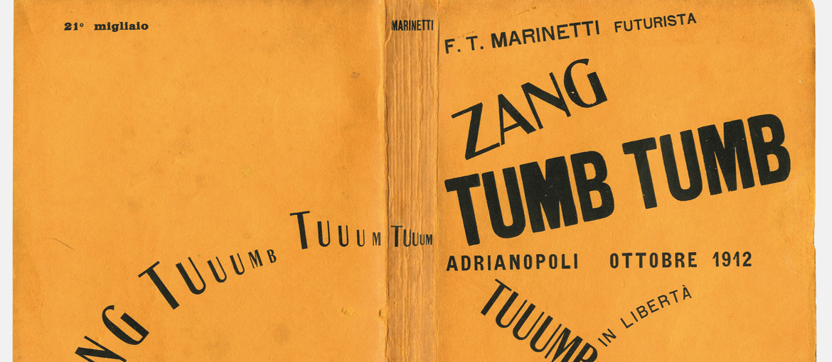
- Orange (#e69737): it is taken from the Zang Tumb Tumb (1914) by Filippo Tommaso Marinetti:

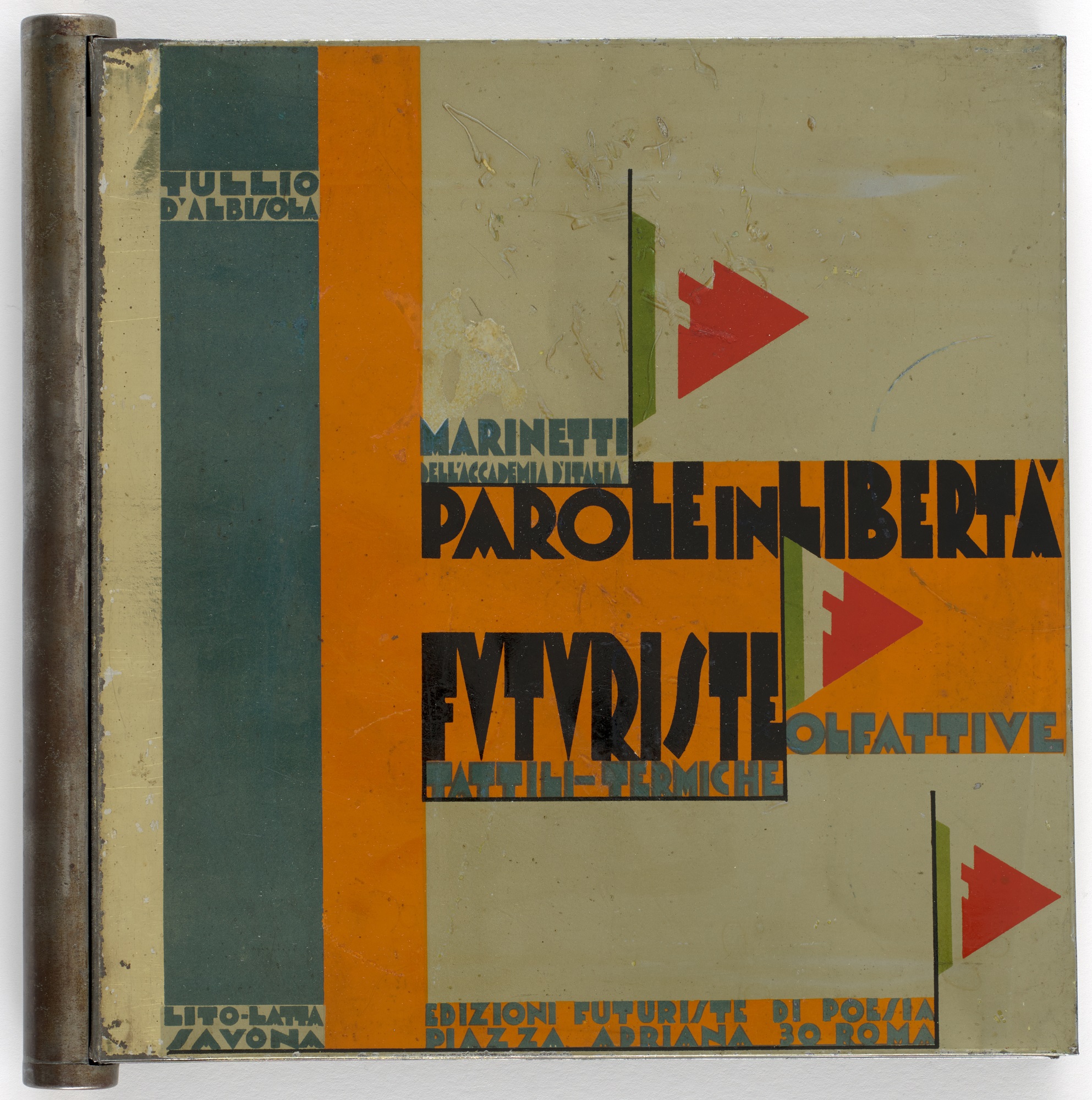
Zang Tumb Tumb (1914) by Filippo Tommaso Marinetti - Green (#384f49): it emulates the contrast between the same orange and this green in another publication that has Marinetti as author, "Parole in libertà"

Parole in libertà by Filippo Tommaso Marinetti
2000s
The second theme of the website represents the print magazines of the 2000s.
Typography
The fonts are: Helvetica and Times New Roman. Both of them are used as standards both in typography and in the digital environment since the second half of the XXth century, for their readability and clearness.
The initial letter of each article (and of the intro) is emphasized with an increase of the font and the use of a different color.
The headers of first level are completely uppercase and present a line separator at the bottom, in order to make it clear and readable.
When present, quotations that are hierarchically siblings of the paragraphs are shown in uppercase and visually separated.
The captions of the images are visualized in a smaller font and in italics, as conventional in most of the magazines.
All the typographical choices follows the principles of clearness but also complementarity of the first decade of the XXIst century, underlying the elements that are of preminent importance (titles, for example) and giving less visual importance to secondary elements (captions for example), always assuring to make all the elements easily readable.
Layout
Page layout
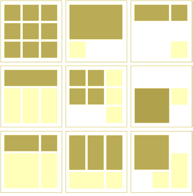
The page is divided in boxes according to the grid system. It is a swiss system born after the World War II in order to give more objectivity to the distribution of elements on the page, by means of mathematical methods. In this website the body is divided in two blocks, one for the text and the other for metadata. The first box occupies 3/4 of the space, that is 3 out of the four columns in which we have ideally divided it. The aside has a background color that aims at underlying this division.
Here is an example of grid system from which we took inspirration:

The margin is the same on all the sides, according to the historical time.
The latest articles's list is not shown in this theme for reason of clearness. An approach of minimalism is more indicated for this historical period, marking the difference between this one and the 1910s, where according to the cubism and the new concept of time, the designer tried to shown multiple aspects on the same surface at the same moment. There is not a loss of functionalities since the same list is available from the navbar. The articles'list is always available in the display for small screen since each box will cover the entire width of the screen, and elements will be aligned vertically in different rows, so there is no need to hide it.
Colors
Since the effect that we wanted to reproduce was of complementarity of the parts, the colors themselves are complementary: the blue and the orange. Those were also popular in some publications of the times, and the famous journl The Guardian
uses a blue background for the header with yellow or orange details yet.
References
- http://guity-novin.blogspot.com/2012/04/modern-newspaper-magazine-layouts.html
- https://guity-novin.blogspot.com/2019/02/chapter-42-swiss-grid-system-and-dutch.html
- http://guity-novin.blogspot.com/2011/08/chapter-44-italian-futurist-visual.html
- https://www.pixartprinting.co.uk/blog/futurism-book-objects/
- https://skylum.com/it/how-to/how-to-make-photo-look-vintage